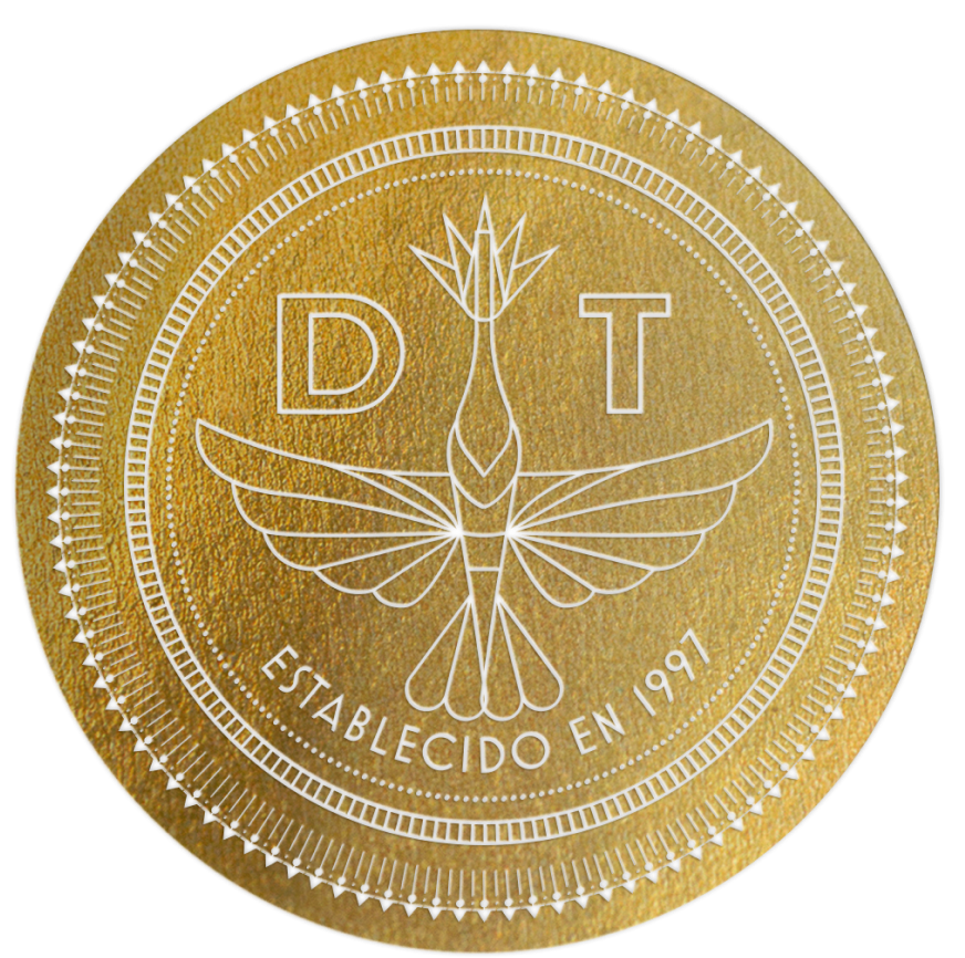
Deco Tequila is a fictional tequila brand that is made of 100% agave tequila from Jalisco Mexico. From the very beginning, I wanted to present tequila in a non-traditional concept. A lot of tequila focuses on the process of tequila with a lot of imagery related to the agave plant itself. Dequo is focused on presenting a fictional story of tequila during the prohibition ages of the 1920s. Our brand is represented by a hummingbird since the nectar of the agave is the preferred sugar for hummingbirds.
• MID-TIER PACKAGING FOR DEQUO TEQUILA •
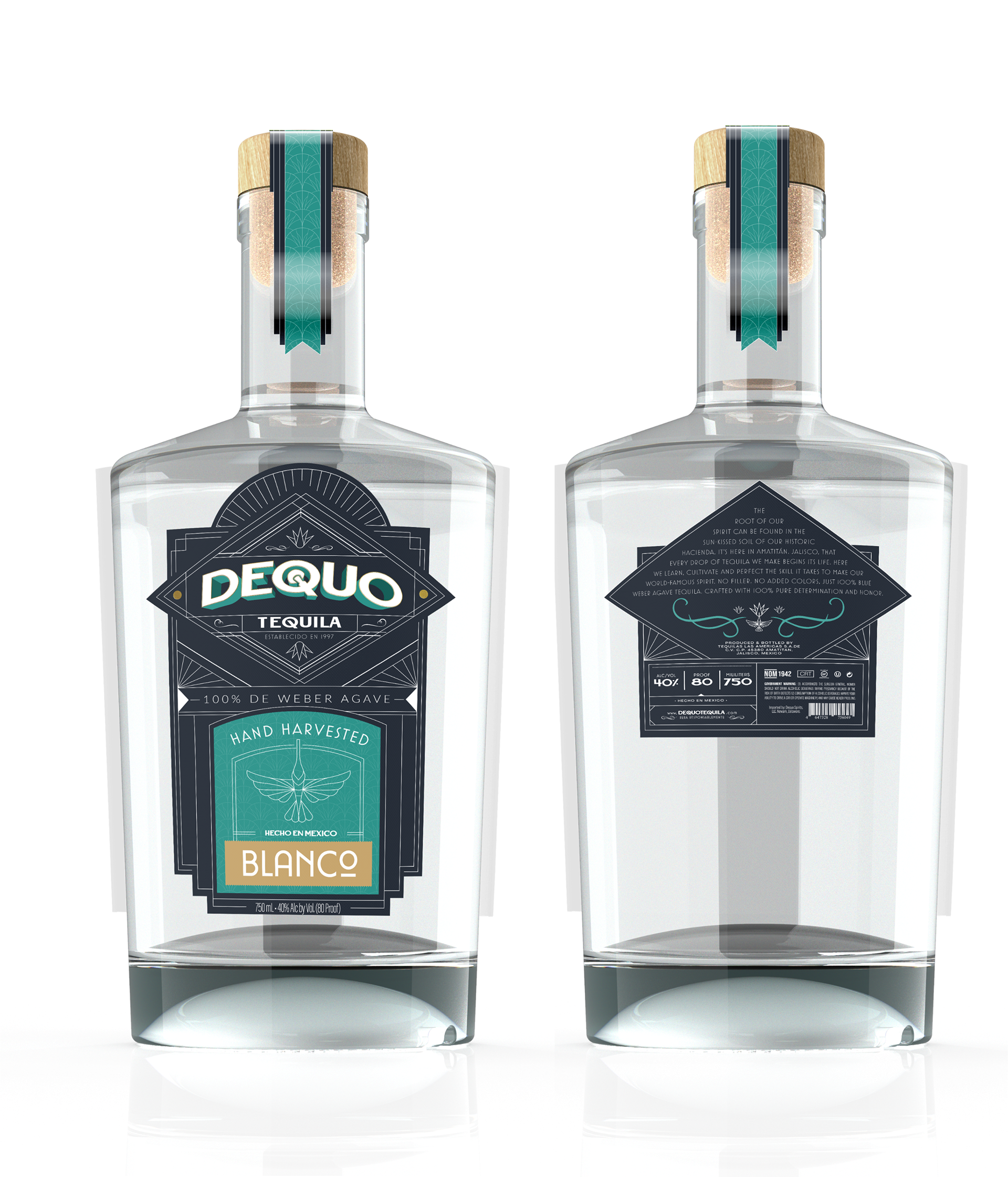
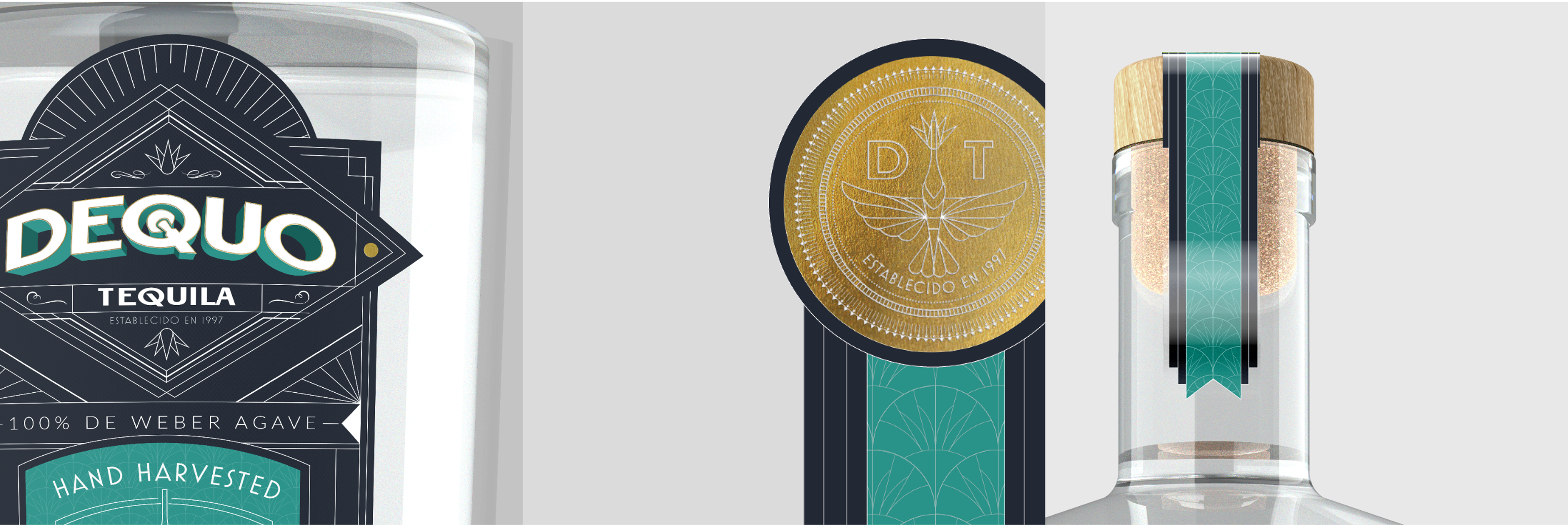
My mid-tier tequila is our blanco. It is un-aged hence the clear color. My designs for the mid-tier play with bringing in color from the agave - which is the teal, and embellishments that reflect the art deco style. The design elements I was going for on the front are a lot of linework and outlines as well as geometric items. The Dequo word logo has a custom Q letter that reflects the spear tool used to harvest agave.
• HIGH-TIER PACKAGING FOR DEQUO TEQUILA •
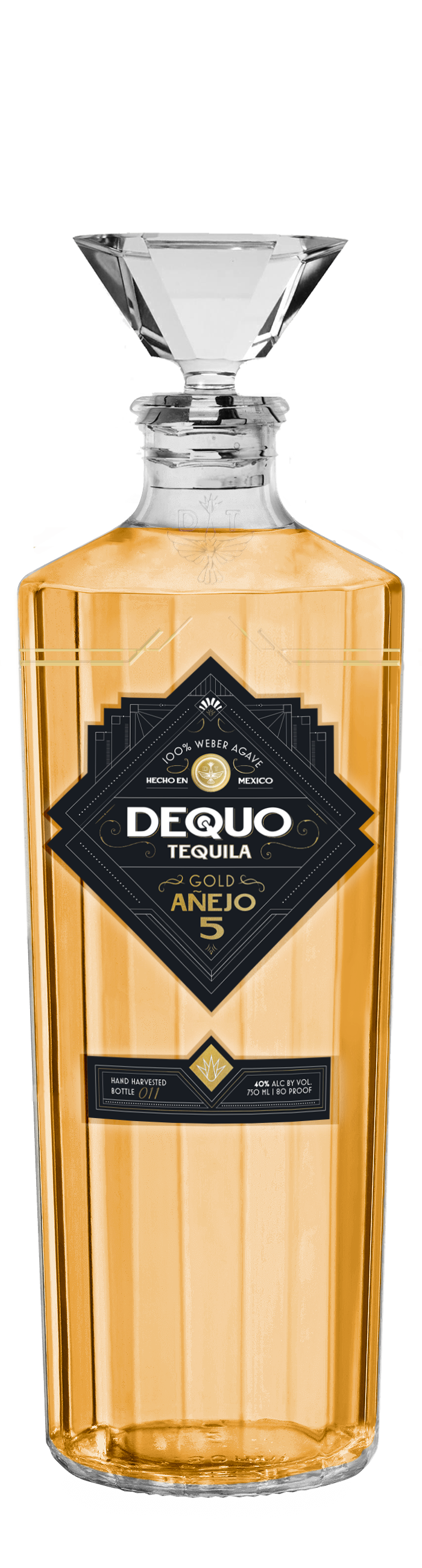
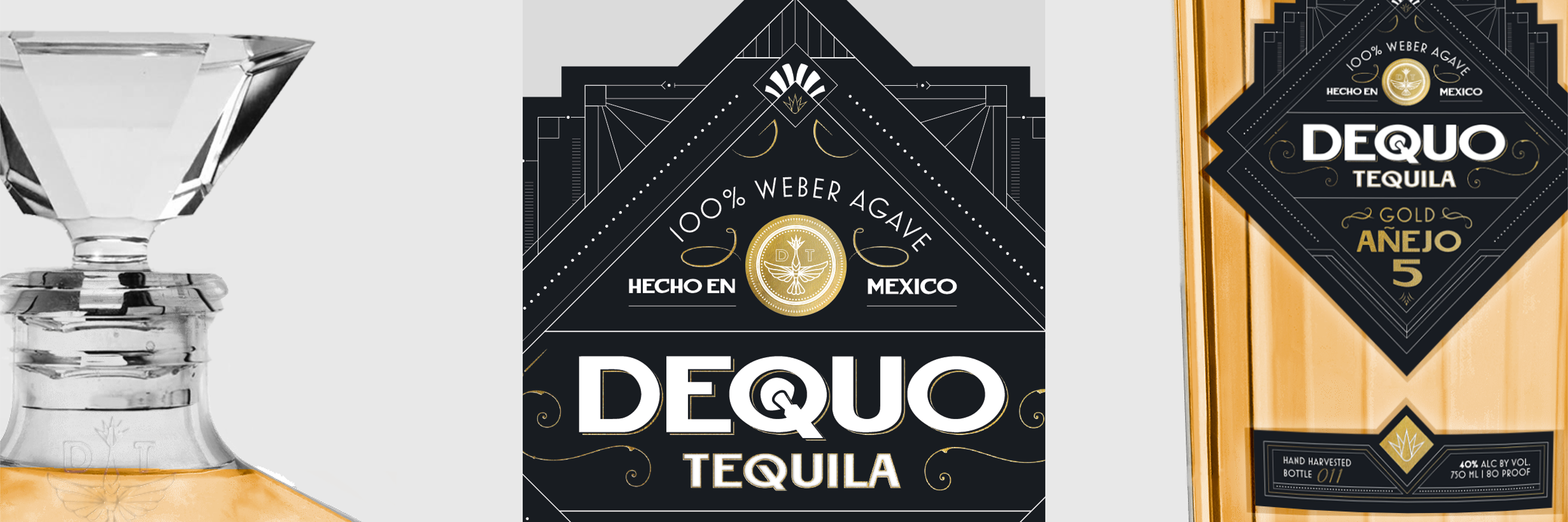
The high-tier bottle is our Anejo tequila. This tequila has been aged/matured for 5 years. The look for the high tier plays with less color and focuses more on shapes and line work. I used black and gold since during the roaring ’20s, gold was often used in a lot of Art Deco designs. The bottle itself is 2 bottles I photoshopped together.
Packaging Project for Art 337 at CSULB